
Below you can see two examples of Power BI reports and dashboards; a simple dashboard that provides insights into website visits and their growth, and a somewhat more extensive sales report that provides insights into sales opportunities.
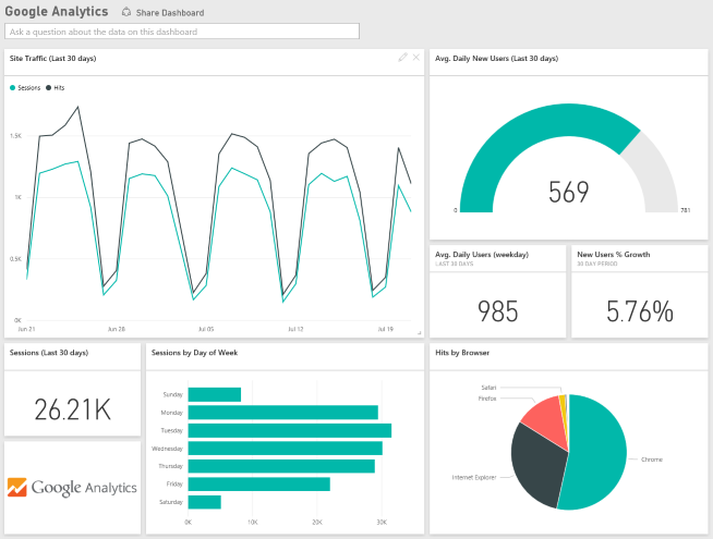
Image 1: Google Analytics dashboard (source: Microsoft.com)

Image 2: sales report (source: Microsoft.com)
These are just examples; you can design your own reports and dashboards the way you want.
Reports vs. dashboards
Reports and dashboards are often confused. Within Power BI, a dashboard is nothing more than a collection of visualizations, such as charts and diagrams, that are placed in the dashboard from one or more reports. In a dashboard, users can not edit the displayed visualizations and their data with filters or slicers.
A dashboard is suitable for presenting information clearly and in outline to certain groups of users, such as a management team and C-level. A dashboard is less suitable for visualising detailed information.
Reports, on the other hand, do contain that detailed information. Users can also edit visualizations and their data with filters or slicers, for example to set a start and end date. The real intelligence is therefore in your reports.
Reports are based on a data set, which includes a data model. You can create multiple reports (and therefore also dashboards) based on this dataset. The use of one or a few datasets for multiple reports improves the performance of Power BI, and also saves on Google Analytics API queries, which means that it takes longer before you reach the API limit.
If you want to know more about building Google Analytics reports and dashboards in Power BI, then download the free ‘Power Analytics’ e-book here.
Now read the other chapters in this tutorial:
- Introduction
- Reports and dashboards
- Analysis
- Data loading
- Data modeling
- Using (free) templates