
In the morning, you grab your coffee, start up your laptop, and log into Google Analytics to see how many visitors and conversions your website has had. Then you log in to your CRM or marketing automation tool to see how many of those visitors have become leads or customers. And then you log in to your administration to see how much revenue both these new and your existing customers have generated in the past few days. Every day. A bit cumbersome, isn’t it?
Why dashboards?
If this is recognizable to you, then it is time for good dashboards that provide you with all these insights at a glance, even before your coffee is cold. And if this is not recognizable to you, then it is probably recognizable to your team, department or colleagues. With good dashboards, both you and they can make more informed decisions. Decisions that can improve results.
But how do you do that?
Tools; what do you need?
To get started, you need a dashboarding tool. Limit yourself to one tool because the use of multiple dashboarding tools takes more time and therefore ultimately leads to cold coffee.
Excel
A lot of less data-driven companies and organizations still work with Excel sheets in which tables are converted into graphs and diagrams. This is labor-intensive and prone to errors. If you share sheets with colleagues, multiple versions are created and therefore also multiple truths, which can lead to incorrect insights and decisions.
Google Data Studio
Another popular tool, especially among marketers, is Google Data Studio. This free dashboarding tool allows you to visualize data from mainly Google sources such as Google Analytics, Google Ads, Google Sheets and BigQuery. If you want to add data from, for example, Facebook and Instagram, you need a so-called “partner connector”. Such connectors are not free; you will pay about $ 50-100 per month.
In addition, Google Data Studio has some serious disadvantages. For example, it is difficult to link data from different sources and place it in one graph or table. You will often need this, for example if you want to report your Facebook and Instagram campaign costs of this year against the number of new customers they have delivered and the turnover that these customers have generated this year according to your CRM or accounting package. In addition, with Google Data Studio you can hardly edit and clean up data, something you will often need because data from different sources does not always match and is immediately usable.
(Power) BI
If you want to use a slightly more professional dashboarding tool, then you go towards BI (Business Intelligence) tools such as Power BI, Tableau, Qlik, Looker etc. Most of these tools are expensive to use as well to maintain, and require an underlying database or data warehouse. Only Power BI is relatively cheap to use and maintain, and can be directly connected to a large number of different (marketing and sales) data sources. You can use Power BI Desktop for free, or choose the Pro version of $ 10 per month with which you can automatically refresh reports and share them online with colleagues. If you want to get started with dashboarding seriously, I advise you to take a look at this solution. Here you will find an overview of the main differences between Power BI and Google Data Studio.
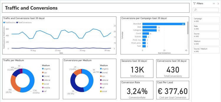
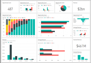
Below you will find a few examples of marketing and sales dashboards that have been made in Power BI.
 |
 |
Approach; where do you start and how do you proceed?
Use the following step-by-step plan to create your dashboards:
Step 1: Determine your KPIs
Your KPIs (Key Performance Indicators) follow from your objectives. These KPIs are a main part of your dashboards. Think of KPIs like: numbers of visitors and conversions, numbers of new leads and active customers, numbers of customers who have left or are generating less profit, customer value, customer satisfaction, average order value, turnover, costs and margins, delivery times, completed customer service calls, etc. You usually visualize KPIs as numerical numbers (totals, averages) in your dashboards and process them in graphs or diagrams.
Step 2: Determine your drivers
Drivers are the variables that control and influence your KPIs. Examples of drivers are date or periods, channels, campaigns, advertisements, keyword search rankings, content, target groups or personas. You also want to see the performance of your drivers in your dashboards; if they perform poorly, your KPIs will go down and you will not achieve your goals. You can also visualize the values of some drivers as numerical numbers (totals, averages) in your dashboards, for example the average CPC (cost per click) in advertising or the average search engine position of certain keywords or groups of keywords in SEO. You will also use drivers such as date/period or campaigns and advertisements as filters, to filter the values of the KPIs in your dashboards.
Step 3: Combine KPIs and drivers
Write down for yourself which drivers control and influence which KPIs (if you are not sure, look for someone who can analyze this for you). If you use graphs or diagrams in your dashboards, you will often place the KPIs on the Y axes and the corresponding drivers on the X axes.
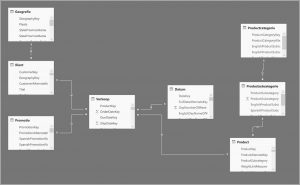
If you have a lot of KPIs and drivers, it is advisable to outline how they are linked. We also call this a data model. Below you can see an example of a data model.
Step 4: Sketch your dashboards
It helps if you now sketch your dashboards on paper or in PowerPoint, for example. Is one dashboard sufficient or do you need more, for example for different colleagues or departments? Which insights belong together on one page? How do you want to display it? As a number, in a chart, in a diagram, table, matrix, cluster chart, box plot, or something else? And which drivers are you going to add to your filters, so that you can filter the values of your KPIs on these drivers?
Step 5: Build your dashboards
Once you have chosen your tool, have determined which (KPI and driver) data you want to load, and have outlined how you want to organize and visualize it, now is the time to start your dashboarding tool and get started. How you do this exactly depends on the tool you choose for this. If you choose Power BI and you want to visualize data from Google Analytics, among other things, then you will find a tutorial for this here.
Get started!
With the above step-by-step plan you can get started right away. If you have any questions about this, contact me for help or support.